Why Spin to Win Apps Still Matter
If you look at how mobile apps have changed over the past few years, one thing becomes pretty clear—everything is getting simpler.
Not simpler in a boring way, but in a “don’t make me think” kind of way. Apps aren’t trying as hard to impress anymore. You don’t see overloaded animations or complicated flows as often. Instead, the focus has shifted to speed, clarity, and just getting things done quickly.
And somehow, in the middle of all that, one small feature keeps showing up: the spin to win app mechanic.
If you’ve ever explored how these systems actually function behind the scenes, this breakdown of how spin to win mechanics really work gives a clearer picture of what users are actually interacting with.
At first glance, it sounds gimmicky. But in practice, it serves a very specific purpose. It gives users a quick moment of feedback, something visual that confirms “okay, something just happened.”
Not necessarily winning. Just… clarity.
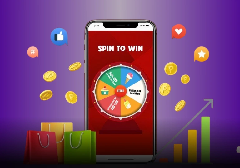
What Is a Spin to Win App, Really?
Most people already know what this looks like.
You tap a button.
A wheel spins.
It lands on something.
That’s it.
Behind the scenes, though, it’s a bit less exciting than it looks. In many cases, the result is already decided before the wheel even starts spinning. The animation is just there to show the outcome, not determine it.
And honestly, that’s not a bad thing.
It turns the whole feature into more of a visual explanation tool rather than a game of chance. The spinning just makes the result feel smoother, less abrupt
Why It Feels So Natural to Use
There’s a reason people don’t get confused when they see a spinning wheel in an app.
We’ve seen similar motions everywhere:
- Loading icons
- Refresh buttons
- Progress circles
That spinning movement already means something in our heads—it means “wait a second, something is happening.”
So when apps use that same motion here, users don’t need instructions. They just get it.
And on mobile, that matters a lot. Nobody wants to read instructions for something that should take two seconds.
Built for Short Attention Spans (Because That’s Reality)
Let’s be honest—most people don’t spend long sessions inside apps anymore.
It’s quick:
Open → Tap → Check → Leave
Spin interactions fit perfectly into that behavior.
There’s no setup. No thinking. No decisions to make. You just tap once, wait for a second or two, and you’re done.
If you want to see how this behavior translates into real usage patterns, this guide on modern mobile spin app experiences explains why these features keep showing up across different apps.
A Small Detail That Actually Improves Experience
In design terms, this falls under what’s called a micro-interaction.
Basically, those tiny moments that make an app feel alive.
Instead of showing a plain message like “processing…” or instantly jumping to a result, the spin creates a short transition. It fills that awkward gap where nothing would otherwise happen.
It’s subtle, but it makes a difference.
You feel like the app is responding, not just switching states.
Simple, Clear, and Hard to Misunderstand
One thing spin-based layouts do really well is clarity.
Everything is right there on the screen. No hidden menus. No extra steps.
You don’t need to figure anything out. You already know:
- What to tap
- What will happen
- When it’s finished
And that kind of clarity is actually harder to design than it looks. Especially on small screens.
But What About Trust?
Here’s where things get a bit more interesting.
Users today are more aware than before. They know apps use animations. They know not everything is random.
That’s why many users look into deeper reviews like whether spin-based apps are real or not before fully trusting the experience.
So the better implementations don’t try to fake unpredictability. They just present results clearly.
Sometimes there’s a label. Sometimes a short explanation. Nothing overcomplicated.
And that transparency matters. Because once users feel tricked, even slightly, it’s hard to win that trust back.
Accessibility Matters More Than Ever
Another reason this pattern works—it’s easy.
There’s usually:
- One button
- One action
- One outcome
That’s it.
No learning curve, no confusion. It works for almost everyone, including users who aren’t very tech-savvy.
And when something works without needing explanation, that’s usually a good sign the design is doing its job.
Why This Format Works Almost Everywhere
The wheel format is surprisingly flexible.
You can change the colors, the labels, even the theme—but the interaction itself stays the same.
And because it doesn’t rely on language too much, people from different regions can understand it instantly.
That’s a big reason why it keeps appearing across different apps and markets.
It Looks Random… But Feels Predictable
This might sound contradictory, but it’s actually the key.
Even though the spinning suggests randomness, the experience itself is predictable.
Users know:
- What happens when they tap
- How long it takes
- What the end looks like
And in a world full of endless choices, that kind of predictability is actually comforting.
Where You Usually See Spin Features
These features rarely take center stage.
Instead, they show up in moments like:
- After finishing something
- While waiting
- During onboarding
They’re more like in-between interactions rather than main features.
And that’s exactly where they work best.
From a Technical Point of View (Quick Insight)
From the backend side, it’s pretty straightforward.
The system decides the result.
The animation just displays it.
That separation makes it easy to maintain and reuse across different parts of an app.
It’s simple—but effective.
So Why Is It Still Around?
Because it solves a very specific problem.
It:
- Shows feedback clearly
- Doesn’t require effort
- Fits fast user behavior
- Adds just enough engagement
Not flashy. Not essential. But useful.
Final Thoughts
Once you strip away the animation, what’s left is actually pretty simple.
A spin to win app feature isn’t really about winning anything.
It’s about showing results in a way that feels smooth, quick, and easy to understand.
And in modern mobile design, that’s more valuable than it sounds.
Frequently Asked Questions
A spin to win app is a mobile feature that uses a spinning wheel to display a predefined result visually.
In most cases, no. The system determines the result before the animation plays.
They improve engagement, provide feedback, and simplify user interactions.
Usually not. It’s typically used as a supporting interaction during transitions.