Mobile apps today don’t try to impress users the way they once did.
They try to stay out of the way.
Design has become quieter. Interactions are shorter. Animations are used only when they help explain what’s happening. In that environment, certain interface patterns continue to show up—not because they are exciting, but because they work.
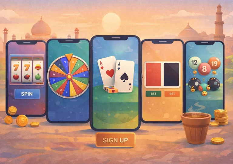
One of those patterns is the spin wheel, often referred to as a spin to win app feature.
Despite how the name sounds, these interactions are rarely about winning anything. More often, they are about showing progress, revealing an outcome, or giving users a moment of visual feedback while a system process completes.
This article explains how spin-based features fit into modern mobile experiences, why designers still use them, and what role they actually play.
What a Spin to Win App Really Is
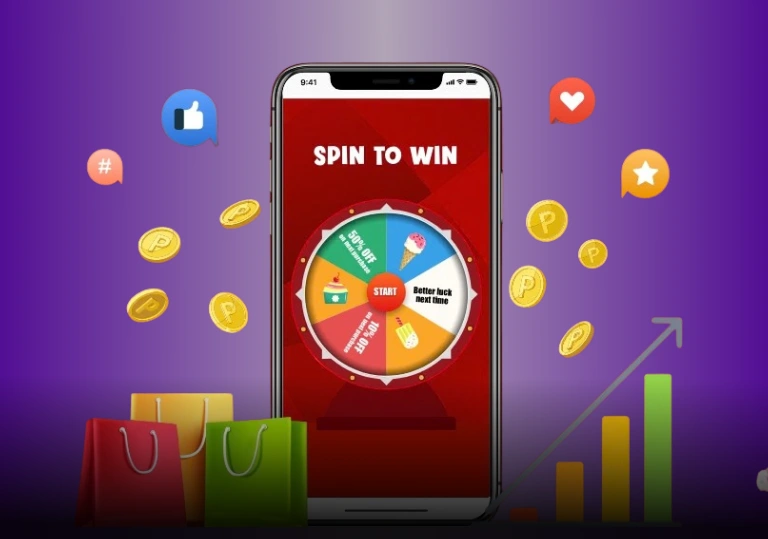
A spin to win app typically displays a circular wheel divided into sections. Each section represents a predefined outcome. The user taps a button, the wheel spins briefly, and then stops on a result.
That’s the full interaction.
Behind the scenes, the outcome is usually determined by the system itself. The spinning motion does not choose the result. It presents it. The animation exists to make the process visible, not unpredictable.
Seen this way, the wheel is a communication tool. It shows that something has happened and that the system has reached a conclusion.
Why Spin Interfaces Feel Familiar
Most users understand a spinning motion without needing an explanation. Circular movement has been part of digital interfaces for years, from loading indicators to refresh icons and progress rings. Over time, spinning has come to signal that something is happening in the background.
That familiarity is also reinforced by wider cultural use, including the origin of the “spin to win” reference, which has been discussed across media and online communities. On mobile screens, where attention is limited, this shared understanding matters. Users don’t need instructions. The motion explains itself.
As a result, spin-based interfaces tend to feel natural, even the first time someone encounters them.
How Spin to Win App Design Matches Mobile Attention
People use mobile apps in short bursts. A few seconds here, a quick check there. Long instructions don’t fit that behavior.
Spin interactions follow a simple pattern:
Tap.
Brief wait.
Clear outcome.
There’s no decision-making involved. Nothing to remember. The interaction completes itself.
Because of this, spin features are usually optional. They don’t block progress or demand engagement. They exist as a small moment that resolves quickly and lets the user move on.
Spin to Win Apps as Micro-Interactions
Modern mobile design relies heavily on micro-interactions. Small responses that make an interface feel responsive without drawing attention to themselves.
Spin wheels work well in this role. Instead of showing a static message or silent delay, the app offers a short animation. The user sees motion, waits briefly, and receives feedback.
It’s not dramatic.
It’s not distracting.
It simply fills an otherwise empty pause.
Visual Engagement Without Complexity
Spin-based layouts balance movement and simplicity.
Everything is visible at once. There are no menus to open or steps to follow. On a small screen, that clarity matters.
The wheel explains itself visually. Users understand what’s happening without needing to read instructions. That’s why designers continue to use this format across different types of apps.
Transparency and User Understanding
Users today are more aware of how apps work. Animations alone no longer create mystery.
Well-designed spin to win apps make outcomes visible and expectations clear. Labels are straightforward. Sometimes there’s a short explanation nearby.
The goal is not suspense. It’s understanding.
When users know that the spin is visual feedback rather than a decision-making process, trust stays intact.
Accessibility and Ease of Use
Spin interactions are simple to operate.
There is usually one clear action. One button. One result. That simplicity helps users with different levels of technical comfort.
When implemented properly, spin features also work well with assistive tools. The interaction is discrete, and the outcome can be communicated clearly.
Fewer steps often mean fewer barriers.
Why the Spin Format Works Across Contexts
A wheel divided into sections is widely understood. It doesn’t rely on language, cultural references, or prior knowledge.
Designers can adjust colors, labels, or themes without changing the interaction itself. That flexibility allows spin features to appear across different platforms and regions without confusion.
The mechanic remains familiar even when the context changes.
Predictability as a Design Strength
Although the motion suggests chance, what users actually experience is predictability.
Users already understand what happens when they tap, how long the action takes, and how clearly it ends.
In apps filled with choices and options, this kind of interaction feels low-pressure. It removes thinking rather than adding it.
That predictability is part of why the format continues to work.
Where Spin to Win Apps Fit in App Flows
Spin features are rarely the main focus of an app. They usually appear at transition points.
After a task is completed.
During onboarding.
At moments where the user is already waiting.
The spin fills that pause with visual feedback, then steps aside. Because it doesn’t interrupt the main purpose of the app, it feels like part of the flow rather than an extra step.
System Logic Behind Spin Interactions
From a technical perspective, spin features are straightforward.
The system determines an outcome based on predefined rules. The animation then presents that outcome visually. Logic and presentation remain separate.
This makes the pattern easy to reuse and maintain. Developers can adjust outcomes without redesigning the interface, which is one reason the format appears so often.
A Note on Real-World Examples
This same design approach can be seen on platforms using spin-based interface patterns, where spinning visuals are used to present predefined outcomes clearly, without implying control, advantage, or guarantees.
In these cases, the spin functions purely as visual feedback, not as a mechanism of chance.
Why Spin to Win Apps Still Have a Place
Design trends change, but some patterns remain because they solve a specific problem well.
Spin to win apps:
- Show progress clearly
- Offer immediate feedback
- Require no learning
- Fit short attention spans
When used carefully, they don’t distract or overpromise. They simply make system behavior visible.
That’s why they continue to fit naturally into modern mobile experiences.
Final Thoughts
Once you set aside the animation and phrasing, spin-based interactions become easier to understand. They are design patterns. Familiar ones. Practical ways to show outcomes without friction.
Most of the time, that simplicity is exactly the point.
Frequently Asked Questions
It’s a mobile interface feature that uses a spinning wheel to present a predefined result. The spin is visual, not a decision process.
Usually not. The result is typically set by the system, while the animation shows that outcome to the user.
They are easy to understand, quick to complete, and work well on small screens with limited attention.
Most of the time, no. Instead, it’s usually a supporting interaction used during transitions or brief engagement moments.